Branding is what makes a brand distinctive. It is the unique characteristics, public image, reputation and identity all in one.
The style of digital media and physical products are dictated by the branding - consistency is key for the audience to recognize a brand in a crowd.
The aesthetic is a defining pillar of branding, as it greatly affects how the audience will interpret and judge the brand when looking at it.
If you just came from the Retail Packaging page of my portfolio, a couple items might look familiar, but I have something different to say on them here.
Please scroll down to see how I can breathe life and personality into a new brand. And even further down, how I can expand content within an existing one.
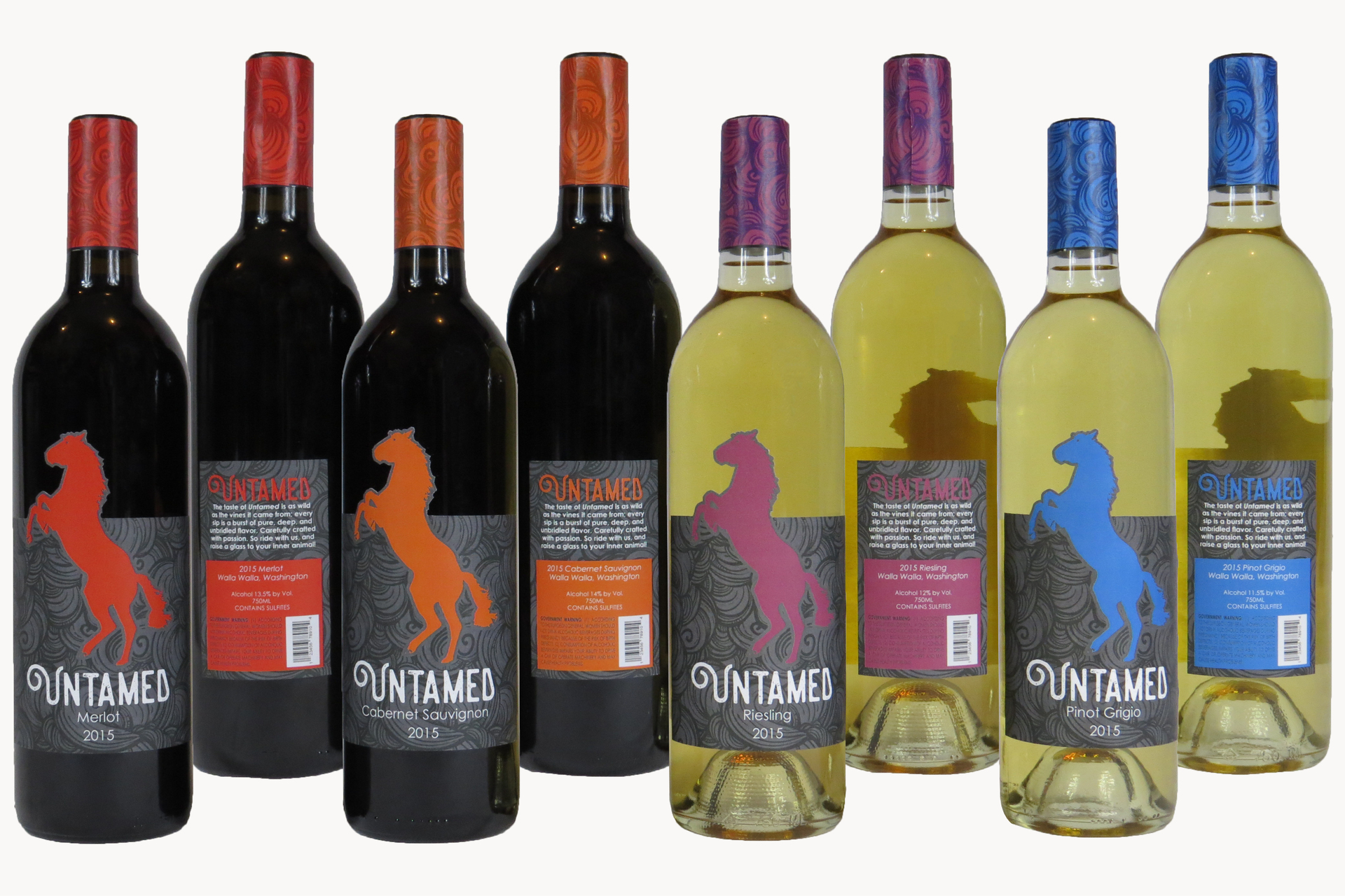
Untamed is a fictitious line of wine, produced locally within Washington State. In contrast to many of its refined competitors, this brand appeals to your inner wild side (and not just the one that comes out after too many glasses, if you know what I mean). The rearing stallion is a universal symbol of the wild, and on every bottle it appears to be trying to break free thanks to the custom die-cut label, implying that the wine inside is bursting with flavor.
The rearing stallion's silhouette shape, the elegant swirling wind pattern, and the typography are consistent across each type of wine. Only the color changes, as a way to help customers quickly find the type they want in the store. By keeping a majority of the look universal while still allowing for individual markers, the customer is presented with a family of products that clearly relate but can still stand out from each other.

It's a given that icons must communicate their meaning quickly and clearly, and be recognizable at any size. For an aquarium with a target audience of children, there were additional challenges. While the design needs to be simple for when it's shrunk down, it also needs enough detail that a child can identify it for what it is.
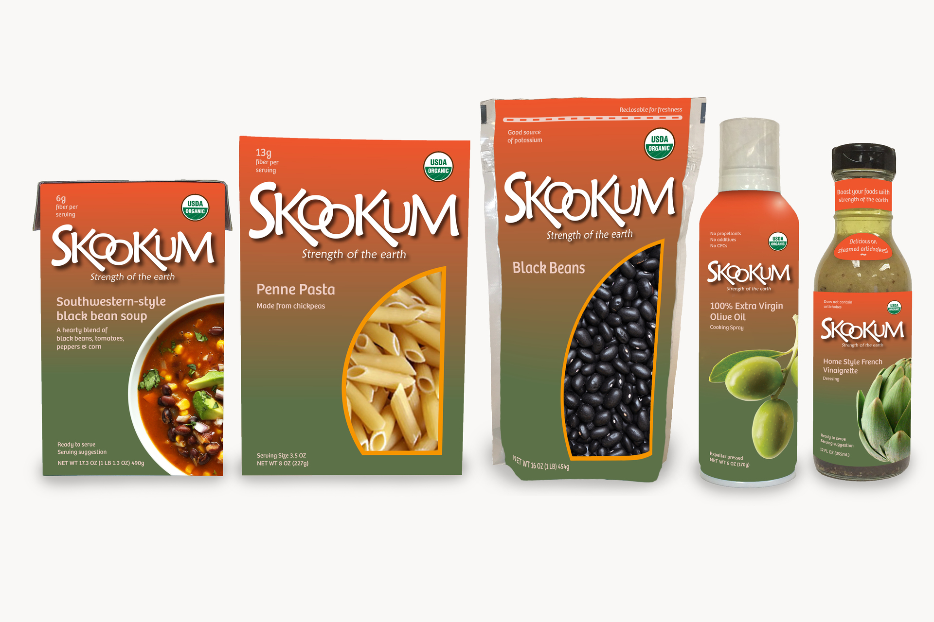
We've all seen the organic food labels with their rustic designs and muted color palettes. With the fictitious grocery brand Skookum, I decided to give organic a fresh and modern twist. The word "skookum" is a real word from the Native American Chinook tribe, and is used to describe someone or something that is strong, bold or impressive. Clean lines, rich colors, and bold text make this line of organic food stand out from the rest. The use of revealing windows in the packaging whenever possible, with detailed photographs taking that place when a window is not practical, act as the cherry on top.
Certifications and official seals can give a brand the edge over competitors that lack such badges. With Skookum, the USDA Organic seal is clearly visible on every product.Cert

As a company grows, so too do the creative assets used in design. Icons can be especially tricky as they need to communicate a great deal despite their minimalist nature. When expanding upon a pre-existing collection, whatever new ones are created must look as if they've always been there, fitting in with the others like pieces to the puzzle.
Filled or outlined, colorful or monochromatic, detailed or simplistic...
I admit, I can get a little nerdy over iconography - it's like a whole other language and it fascinates me.
The decision was made at Animal Supply Co. to brand the varied communications channels for retailers and vendors, streamlining messaging and content across 8 distribution regions (Northwest, Mountain, Central, Ohio Valley, Northern CA, Southern CA, Southern, Southeast) and the brand partners. I chose the colors based on the dominant colors used for the material the team produces. Brown is the dominant color for promotion sheets, and teal is the dominant color for event sheets and collateral. The deep purple on the ampersand adds contrast. The Animal Supply Company logo is in a light gray, reminding the reader that the team is a part of Animal Supply Co., but the group addressing them in the email is the Promotions & Events Team.
Additionally, I created section headers for the Promotions & Events News e-blast. The colors correspond to the colors of the material to which they refer.

