Across all fields and industries that produce physical items for customer use and or consumption, packaging is how the brand speaks and connects with you.
The colors, the fonts, the packaging materials and even the shape of the container all must work in harmony to call out to and reach the target audience.
We as humans subconsciously consider many factors when choosing between similar products.
How does it look and feel? What's the quality? Does it suit my lifestyle, my tastes? Do I like the attitude or personality of the brand that makes it?
Packaging is visual communication it its most tangible form. So scroll down and see how I can make a product speak for itself.
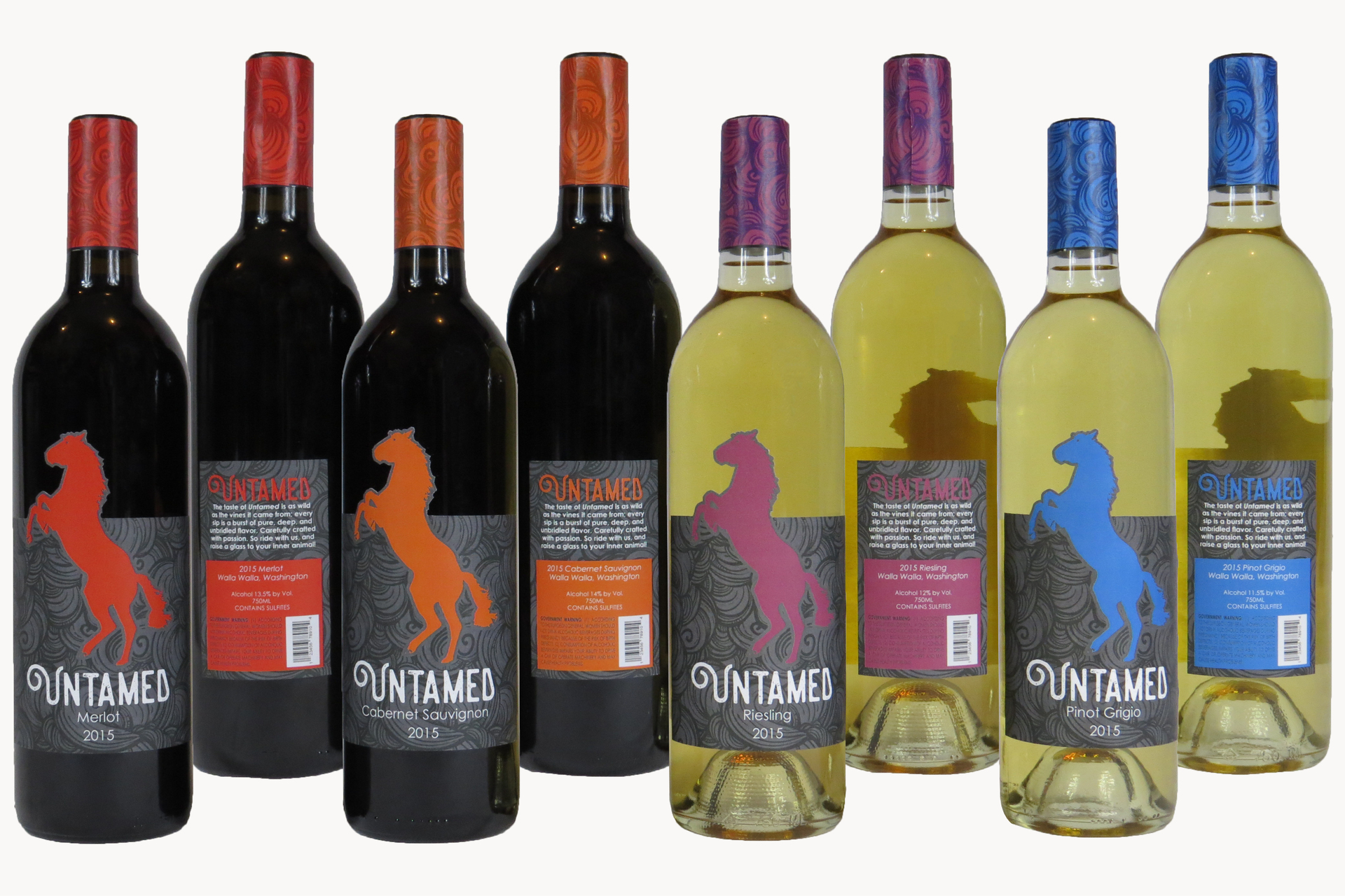
The fictitious wine brand, Untamed produces more than one wine. Each kind must follow the brand standard, yet also be distinguishable within the brand. The core elements of the branding all stay the same on every bottle. But the color changes with each type of wine. This allows for easy identification and recognition in the store. In example: if you’re craving an Untamed Riesling, just look for the violet stallion.
And there's more to Untamed than you might think. Check out the slideshow below to see how it can become the perfect gift.

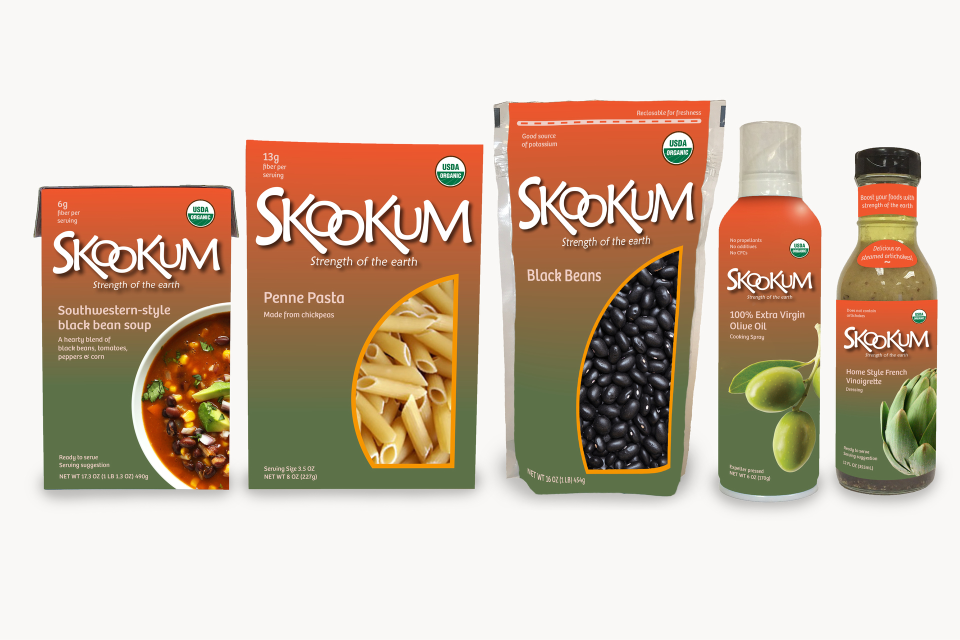
More often than not, packaging dimensions vary quite wildly within a given family of products. As a fictitious organic grocery line, I imagined Skookum produces a wide variety of foods from basic ingredients to convenient meals. This meant that the branding had to flex with the unique measurements and materials of each container, while still maintaining the colors, typography, and overall crisp look that all lend to the identity of Skookum.
Showcasing how the design adapts to different containers, this set features a liquid carton, dry carton, plastic bag, aerosol spray can, and glass bottle.

